Тест
Тест
Страница: 1
Сообщений 1 страница 9 из 9
Поделиться12026-08-25 11:39:06
- Администратор

- Зарегистрирован: 2026-05-16
- Приглашений: 0
- Сообщений: 16777215
- Уважение: [+1/-0]
- Позитив: [+6/-0]
- Провел на форуме:
2 дня 5 часов - Последний визит:
2026-10-08 22:43:45
Поделиться22026-08-25 11:45:15
<!DOCTYPE html>
<html lang="ru">
<head>
<meta charset="UTF-8">
<meta name="viewport" content="width=device-width, initial-scale=1.0">
<title>Сайт с мини-браузером в футере</title>
<style>
/* Базовые стили для страницы, чтобы контент не перекрывался футером */
body {
margin: 0;
padding-bottom: 320px; /* Отступ снизу равен высоте футера + запас */
font-family: Arial, sans-serif;
}
/* Стили для контейнера-браузера в подвале */
.footer-browser {
position: fixed;
left: 0;
bottom: 0;
width: 100%;
height: 300px; /* Высота вашего мини-браузера */
background-color: #f1f1f1;
box-shadow: 0 -5px 15px rgba(0,0,0,0.2);
z-index: 9999; /* Чтобы браузер всегда был поверх других элементов */
border-top: 3px solid #333;
}
/* Шапка мини-браузера (имитация панели адреса) */
.browser-header {
background-color: #333;
color: white;
padding: 5px 10px;
font-size: 12px;
display: flex;
align-items: center;
}
/* Имитация кнопок управления окном */
.browser-dots {
display: flex;
gap: 5px;
margin-right: 15px;
}
.dot {
width: 10px;
height: 10px;
border-radius: 50%;
}
.dot-red { background-color: #ff5f56; }
.dot-yellow { background-color: #ffbd2e; }
.dot-green { background-color: #27c93f; }
/* Сам фрейм, который загружает сторонний сайт */
.browser-iframe {
width: 100%;
height: calc(100% - 28px); /* Вычитаем высоту шапки */
border: none;
}
</style>
</head>
<body>
<!-- Основной контент вашего сайта -->
<div style="padding: 20px;">
<h1>Основной контент сайта</h1>
<p>Этот текст находится на вашей главной странице. Вы можете скроллить сайт, но окно снизу останется на месте.</p>
</div>
<!-- Подвал-браузер -->
<div class="footer-browser">
<!-- Панель управления (дизайн под браузер) -->
<div class="browser-header">
<div class="browser-dots">
<span class="dot dot-red"></span>
<span class="dot dot-yellow"></span>
<span class="dot dot-green"></span>
</div>
<div class="browser-title">Встроенное окно: https://example.com</div>
</div>
<!-- Встроенный сайт (замените src на нужный вам адрес) -->
<iframe class="browser-iframe" src="https://example.com"></iframe>
</div>
</body>
</html>
Поделиться32026-08-26 09:03:42
- Администратор
- Зарегистрирован: 2026-05-16
- Приглашений: 0
- Сообщений: 16777215
- Уважение: [+1/-0]
- Позитив: [+6/-0]
- Провел на форуме:
2 дня 5 часов - Последний визит:
2026-10-08 22:43:45
<!DOCTYPE html>
<html lang="ru">
<head>
<meta charset="UTF-8">
<meta name="viewport" content="width=device-width, initial-scale=1.0">
<title>Разрисованная Шапка Сайта</title>
<style>
/* Общие сбросы стилей */
* {
margin: 0;
padding: 0;
box-sizing: border-box;
font-family: 'Segoe UI', Roboto, Helvetica, Arial, sans-serif;
}
body {
background-color: #0a0512;
overflow-x: hidden;
min-height: 100vh;
}
/* КОНТЕЙНЕР ШАПКИ */
.cyber-header {
position: relative;
width: 100%;
height: 100vh; /* Шапка на весь экран для вау-эффекта, можно уменьшить до 600px */
min-height: 600px;
background: radial-gradient(circle at 50% 50%, #1a0b2e 0%, #05010c 100%);
overflow: hidden;
display: flex;
flex-direction: column;
justify-content: space-between;
border-bottom: 4px solid #ff007f;
box-shadow: 0 0 50px rgba(255, 0, 127, 0.3);
}
/* АНИМИРОВАННЫЙ ЗАДНИЙ ФОН (Разрисованность и графика) */
.bg-grid {
position: absolute;
top: 0; left: 0; width: 100%; height: 100%;
background-image:
linear-gradient(rgba(255, 0, 127, 0.05) 1px, transparent 1px),
linear-gradient(90deg, rgba(255, 0, 127, 0.05) 1px, transparent 1px);
background-size: 40px 40px;
background-position: center;
transform: perspective(500px) rotateX(60deg) translateY(-100px);
transform-origin: top center;
animation: gridMove 20s linear infinite;
opacity: 0.7;
}
@keyframes gridMove {
0% { background-position: 0 0; }
100% { background-position: 0 800px; }
}
/* Абстрактные светящиеся круги и разводы */
.blob {
position: absolute;
border-radius: 50%;
filter: blur(80px);
opacity: 0.5;
animation: floatBlobs 12s infinite alternate ease-in-out;
}
.blob-1 {
width: 400px; height: 400px;
background: #ff007f;
top: -100px; left: -100px;
}
.blob-2 {
width: 500px; height: 500px;
background: #00f0ff;
bottom: -150px; right: -100px;
animation-delay: -6s;
}
@keyframes floatBlobs {
0% { transform: translate(0, 0) scale(1); }
100% { transform: translate(50px, 40px) scale(1.15); }
}
/* ВЕРХНЯЯ ПАНЕЛЬ: КОМПАКТНАЯ НАВИГАЦИЯ */
.top-nav {
position: relative;
z-index: 10;
display: flex;
justify-content: space-between;
align-items: center;
padding: 30px 50px;
background: linear-gradient(to bottom, rgba(5, 1, 12, 0.8), transparent);
}
.logo {
font-size: 24px;
font-weight: 900;
color: #fff;
text-transform: uppercase;
letter-spacing: 3px;
text-shadow: 0 0 10px #00f0ff, 0 0 20px #00f0ff;
cursor: pointer;
transition: 0.3s;
}
.logo span { color: #ff007f; text-shadow: 0 0 10px #ff007f; }
.logo:hover { transform: scale(1.05); }
/* Компактное меню */
.mini-menu {
display: flex;
gap: 30px;
list-style: none;
}
.mini-menu a {
color: #e0d5f0;
text-decoration: none;
font-size: 14px;
font-weight: 600;
text-transform: uppercase;
letter-spacing: 2px;
position: relative;
padding: 8px 16px;
border: 1px solid transparent;
transition: all 0.3s ease;
}
.mini-menu a::before {
content: '';
position: absolute;
bottom: 0; left: 0; width: 0; height: 2px;
background: #ff007f;
box-shadow: 0 0 10px #ff007f;
transition: 0.3s ease;
}
.mini-menu a:hover {
color: #fff;
border: 1px solid rgba(0, 240, 255, 0.3);
background: rgba(0, 240, 255, 0.05);
box-shadow: 0 0 15px rgba(0, 240, 255, 0.2);
}
.mini-menu a:hover::before {
width: 100%;
}
/* ЦЕНТРАЛЬНЫЙ БЛОК (Контент и арты) */
.header-content {
position: relative;
z-index: 5;
text-align: center;
margin: auto;
max-width: 900px;
padding: 0 20px;
}
/* Элементы разрисованности вокруг текста */
.decor-line {
width: 120px;
height: 4px;
background: linear-gradient(90deg, #00f0ff, #ff007f);
margin: 0 auto 25px;
box-shadow: 0 0 10px #ff007f;
position: relative;
}
.decor-line::before, .decor-line::after {
content: ''; position: absolute; width: 8px; height: 8px;
background: #fff; border-radius: 50%; top: -2px;
}
.decor-line::before { left: -15px; box-shadow: 0 0 8px #00f0ff; }
.decor-line::after { right: -15px; box-shadow: 0 0 8px #ff007f; }
/* Огромный анимированный заголовок с эффектом Glitch */
.glitch-title {
font-size: 72px;
font-weight: 900;
color: #fff;
text-transform: uppercase;
letter-spacing: 5px;
line-height: 1;
margin-bottom: 20px;
position: relative;
animation: titleFloat 4s ease-in-out infinite alternate;
}
@keyframes titleFloat {
0% { transform: translateY(0px); text-shadow: 0 0 20px rgba(0,240,255,0.6); }
100% { transform: translateY(-15px); text-shadow: 0 0 30px rgba(255,0,127,0.8); }
}
.subtitle {
font-size: 18px;
color: #8fa0dd;
letter-spacing: 6px;
text-transform: uppercase;
margin-bottom: 40px;
font-weight: 400;
}
/* Кнопка-Громоотвод */
.cyber-btn {
position: relative;
padding: 18px 45px;
background: transparent;
color: #fff;
border: 2px solid #00f0ff;
font-size: 16px;
font-weight: 700;
text-transform: uppercase;
letter-spacing: 3px;
cursor: pointer;
overflow: hidden;
transition: all 0.4s ease;
box-shadow: 0 0 15px rgba(0, 240, 255, 0.3);
}
.cyber-btn::before {
content: '';
position: absolute;
top: 0; left: -100%; width: 100%; height: 100%;
background: linear-gradient(90deg, transparent, rgba(255, 0, 127, 0.4), transparent);
transition: 0.5s;
}
.cyber-btn:hover {
border-color: #ff007f;
box-shadow: 0 0 30px rgba(255, 0, 127, 0.8);
transform: scale(1.05);
}
.cyber-btn:hover::before {
left: 100%;
}
/* НИЖНЯЯ ЧАСТЬ ШАПКИ И ДЕКОРАТИВНЫЕ ЧАСТИЦЫ */
.bottom-bar {
position: relative;
z-index: 10;
width: 100%;
padding: 20px 50px;
display: flex;
justify-content: space-between;
color: rgba(255,255,255,0.3);
font-size: 12px;
letter-spacing: 2px;
text-transform: uppercase;
}
/* Летающие геометрические элементы (разрисованность) */
.shape {
position: absolute;
border: 2px solid cubic-bezier(0.1, 0.8, 0.3, 1);
opacity: 0.2;
animation: spinShapes 25s linear infinite;
}
.shape-triangle {
top: 25%; left: 10%;
width: 0; height: 0;
border-left: 25px solid transparent;
border-right: 25px solid transparent;
border-bottom: 45px solid #00f0ff;
background: none; border-top: none;
}
.shape-square {
bottom: 30%; left: 15%;
width: 40px; height: 40px;
border-color: #ff007f;
}
.shape-cross {
top: 20%; right: 12%;
width: 30px; height: 30px;
}
.shape-cross::before, .shape-cross::after {
content: ''; position: absolute; background: #fff;
}
.shape-cross::before { top: 14px; left: 0; width: 30px; height: 2px; }
.shape-cross::after { left: 14px; top: 0; width: 2px; height: 30px; }
@keyframes spinShapes {
0% { transform: rotate(0deg) translate(0, 0); }
50% { transform: rotate(180deg) translate(20px, -20px); }
100% { transform: rotate(360deg) translate(0, 0); }
}
/* Эффект плавающих искр / частиц через CSS */
.particles {
position: absolute;
top: 0; left: 0; width: 100%; height: 100%;
pointer-events: none;
}
.particle {
position: absolute;
background: #fff;
border-radius: 50%;
animation: floatParticles 8s infinite linear;
}
/* Разные размеры и позиции для эффекта разрисованности */
.p1 { width: 3px; height: 3px; left: 20%; top: 80%; background: #00f0ff; box-shadow: 0 0 8px #00f0ff; animation-duration: 6s; }
.p2 { width: 4px; height: 4px; left: 60%; top: 40%; background: #ff007f; box-shadow: 0 0 8px #ff007f; animation-duration: 9s; animation-delay: 2s; }
.p3 { width: 2px; height: 2px; left: 80%; top: 70%; background: #fff; animation-duration: 12s; animation-delay: 1s; }
Поделиться42026-08-29 12:03:02
- Администратор
- Зарегистрирован: 2026-05-16
- Приглашений: 0
- Сообщений: 16777215
- Уважение: [+1/-0]
- Позитив: [+6/-0]
- Провел на форуме:
2 дня 5 часов - Последний визит:
2026-10-08 22:43:45
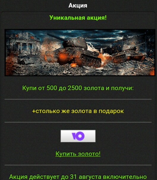
Всем привет в вартанке как всегда интересная акция! Все бежим и тратим деньги на золото!!!
Поделиться52026-08-31 08:19:53
- Администратор
- Зарегистрирован: 2026-05-16
- Приглашений: 0
- Сообщений: 16777215
- Уважение: [+1/-0]
- Позитив: [+6/-0]
- Провел на форуме:
2 дня 5 часов - Последний визит:
2026-10-08 22:43:45
ПеревестиПоделиться62026-08-31 08:33:39
- Администратор
- Зарегистрирован: 2026-05-16
- Приглашений: 0
- Сообщений: 16777215
- Уважение: [+1/-0]
- Позитив: [+6/-0]
- Провел на форуме:
2 дня 5 часов - Последний визит:
2026-10-08 22:43:45
ПеревестиПоделиться72026-08-31 11:24:23
- Администратор
- Зарегистрирован: 2026-05-16
- Приглашений: 0
- Сообщений: 16777215
- Уважение: [+1/-0]
- Позитив: [+6/-0]
- Провел на форуме:
2 дня 5 часов - Последний визит:
2026-10-08 22:43:45
ПеревестиПоделиться82026-10-07 18:24:31
- Администратор
- Зарегистрирован: 2026-05-16
- Приглашений: 0
- Сообщений: 16777215
- Уважение: [+1/-0]
- Позитив: [+6/-0]
- Провел на форуме:
2 дня 5 часов - Последний визит:
2026-10-08 22:43:45
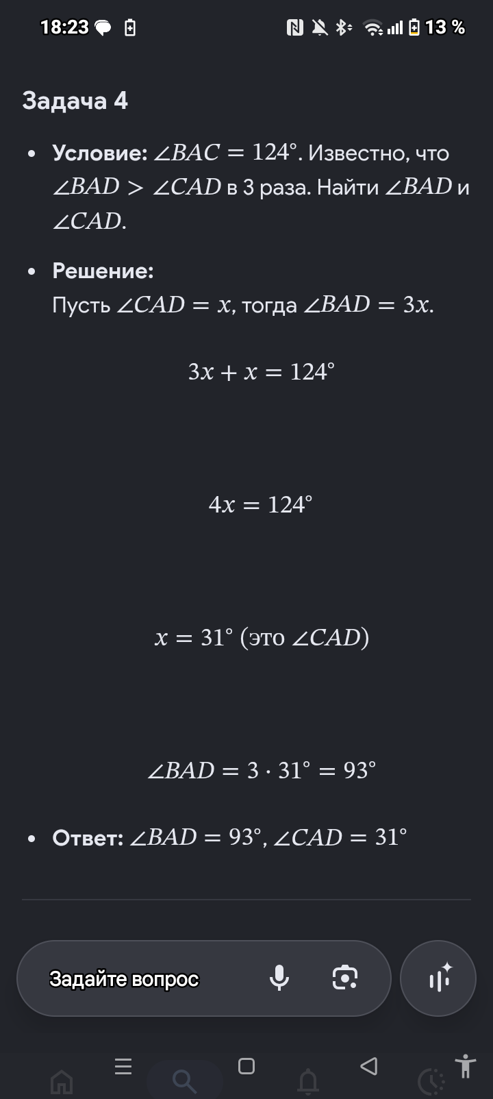
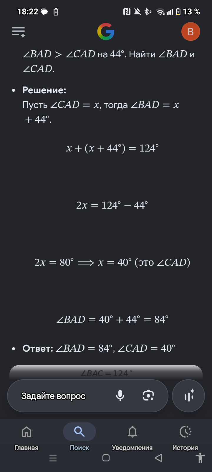
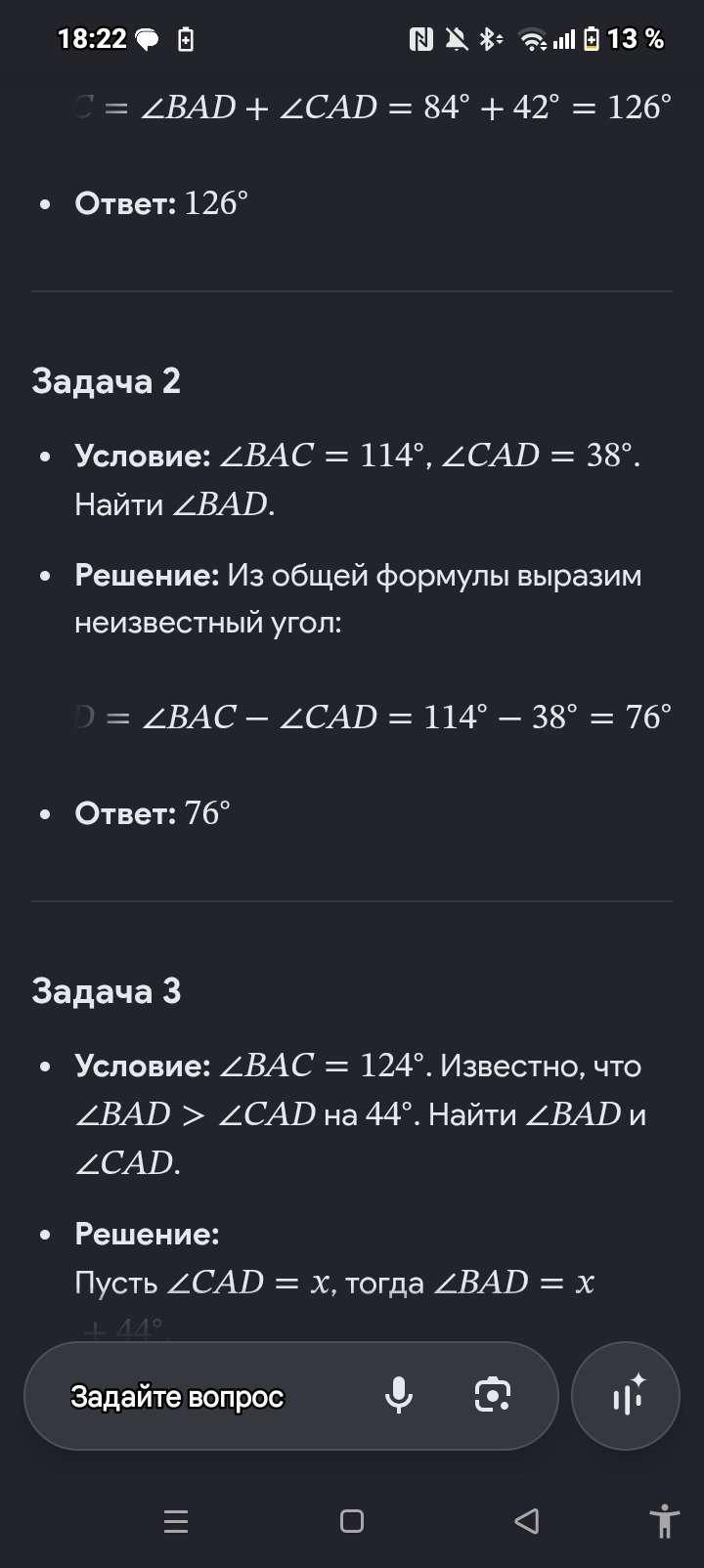
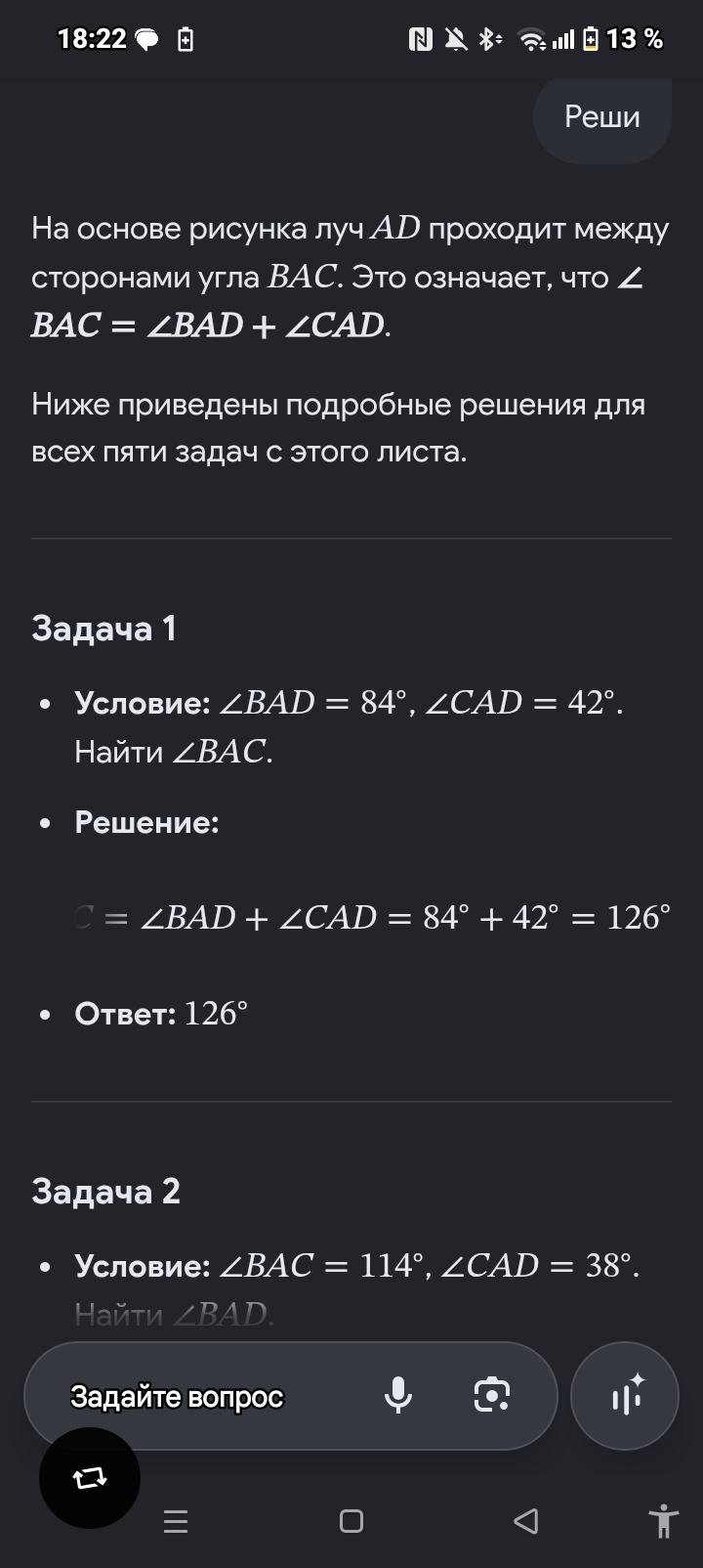
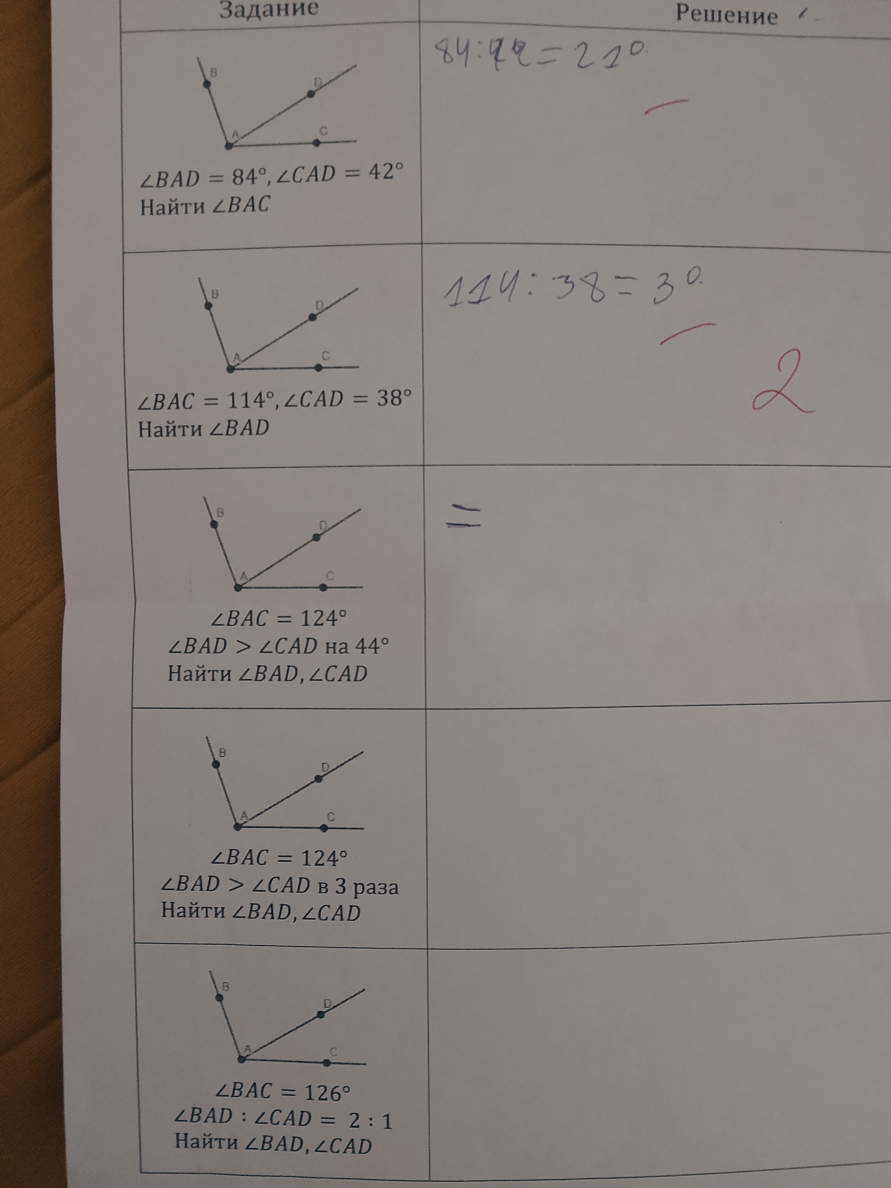
ПеревестиПоделиться92026-10-08 22:43:00
- Администратор
- Зарегистрирован: 2026-05-16
- Приглашений: 0
- Сообщений: 16777215
- Уважение: [+1/-0]
- Позитив: [+6/-0]
- Провел на форуме:
2 дня 5 часов - Последний визит:
2026-10-08 22:43:45
Страница: 1
